01The data-first trap
The default way dashboards get built is: look at what the database holds, put it on screen, arrange it attractively. The result is a page that is technically informative and practically ignored, because reading it does not tell anyone what to do next.
The dashboards that stuck were built the other way round. I started by asking the person who would open it every morning what they were trying to find out, and what they would do differently depending on the answer. Everything that did not serve one of those decisions came off the page.
A metric that cannot change anyone's behaviour is decoration. Decoration competes for attention with the things that matter.
02Lead with exceptions, not totals
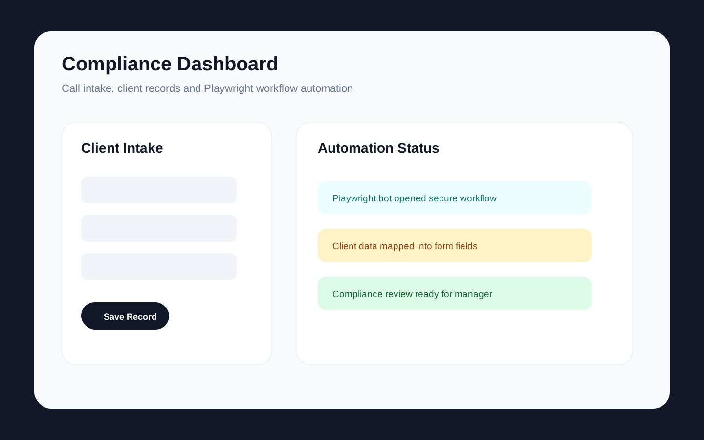
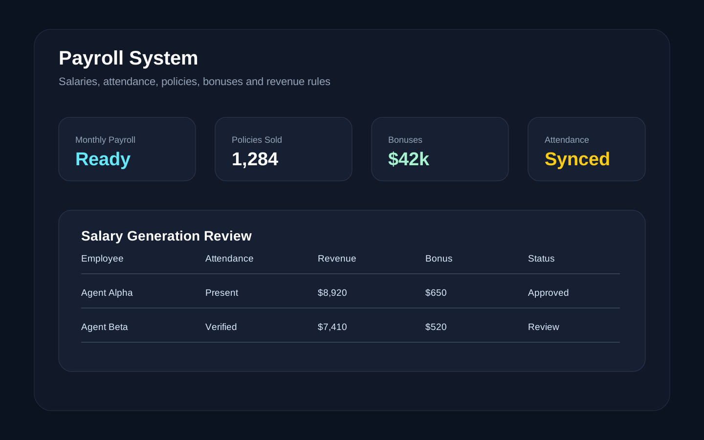
Operational users do not need to be told the normal state of the world; they need to be told where it deviates. A compliance manager does not want the count of compliant records, they want the three that are overdue for review. A payroll administrator does not want total payroll, they want the entries that changed unexpectedly since last month.
So the top of the screen is what needs attention, sized by urgency, each item linking directly to the record where the action happens. Totals move lower — they provide reassurance and context, not instruction.
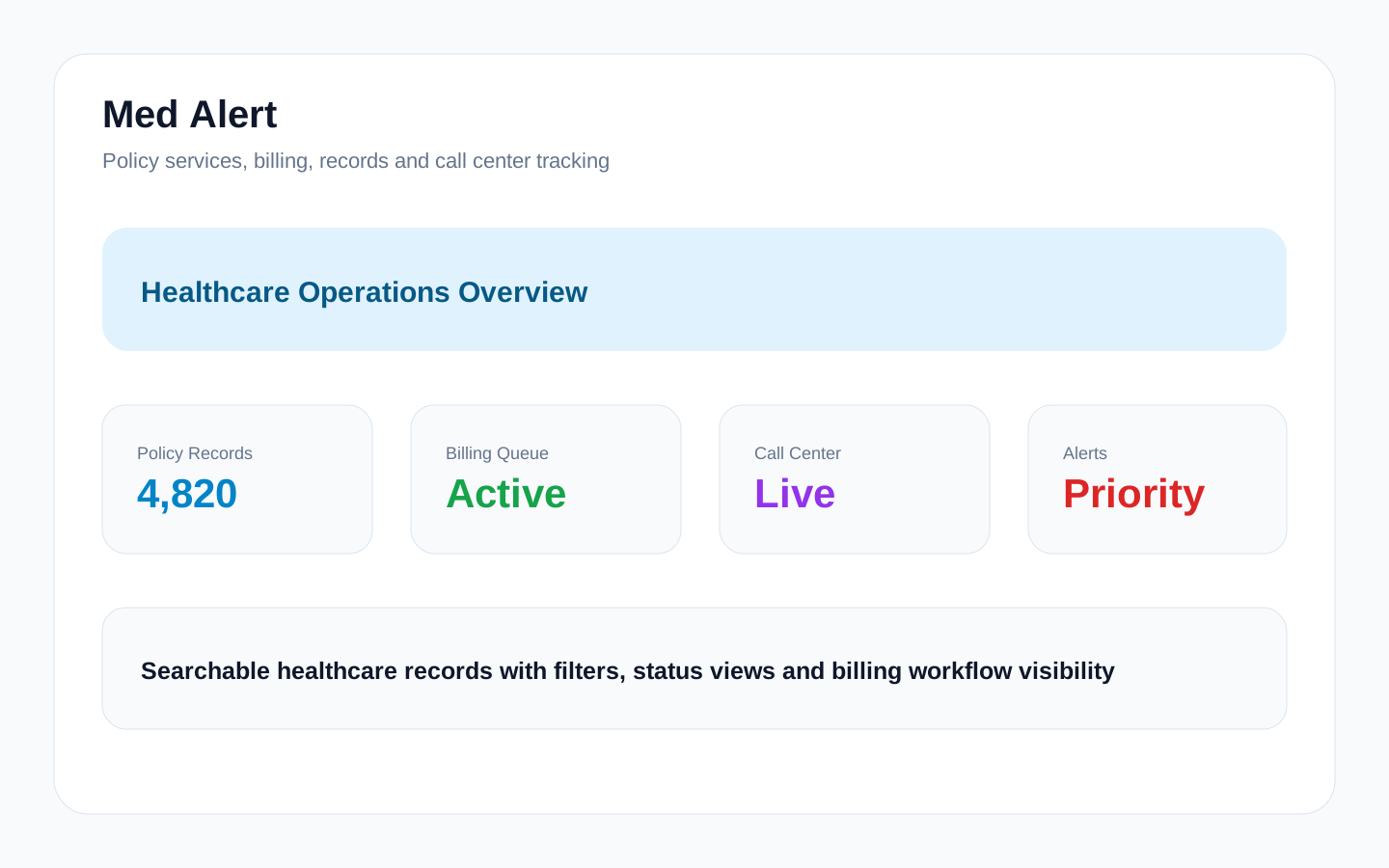
This is also why the alert design in a medical alert platform I built mattered more than its charts. When the cost of missing an item is high, the interface has to make the item impossible to miss: strong colour hierarchy, priority badges, and the action available in the same view rather than two clicks away.
- Put what is wrong above what is normal.
- Make every exception a link to the place where it gets resolved.
- Show the age of a problem, not just its existence — a three-day-old exception is a different situation from a three-minute-old one.
- Reserve strong colour for genuine urgency. If everything is red, nothing is.
03Respect how the screen is really used
Two things I got wrong early and now design for from the start.
First, dense data needs to stay scannable. Operational users read tables, not charts — the chart is for the manager reviewing the week, the table is for the person doing the work. Both need to exist, and the table needs real filtering, sorting and a URL that preserves the filter so it can be shared.
Second, the empty and loading states are not edge cases. A new tenant sees the empty state first, and if it is a blank panel they conclude the product is broken. An empty state should explain what will appear here and what to do to make that happen.
04A test worth applying
Before building a dashboard screen, write down the question it answers and the action that follows. If you cannot state both in one sentence, the screen is not ready to build.
After it ships, watch someone use it without narrating. Where they hesitate is where the design is wrong, and it is almost never where you expected.
Found this useful?
I write these from live project work. Follow along or get in touch if you want this kind of thinking applied to your product.